The challenge
Actimizer had built a solid product but their activation rates told a different story. Users were signing up and hitting a wall — the dashboard had grown organically over two years and the information architecture reflected that: scattered, inconsistent, and hard to navigate for a first-time user.
The target: cut time-to-first-action in half. The actual result went further than that.
The approach
We began with a full UX audit — session recordings, user interviews, and a heuristic evaluation against Nielsen's 10 usability principles. The findings shaped a clear priority list: navigation structure first, onboarding flow second, and individual view improvements third.
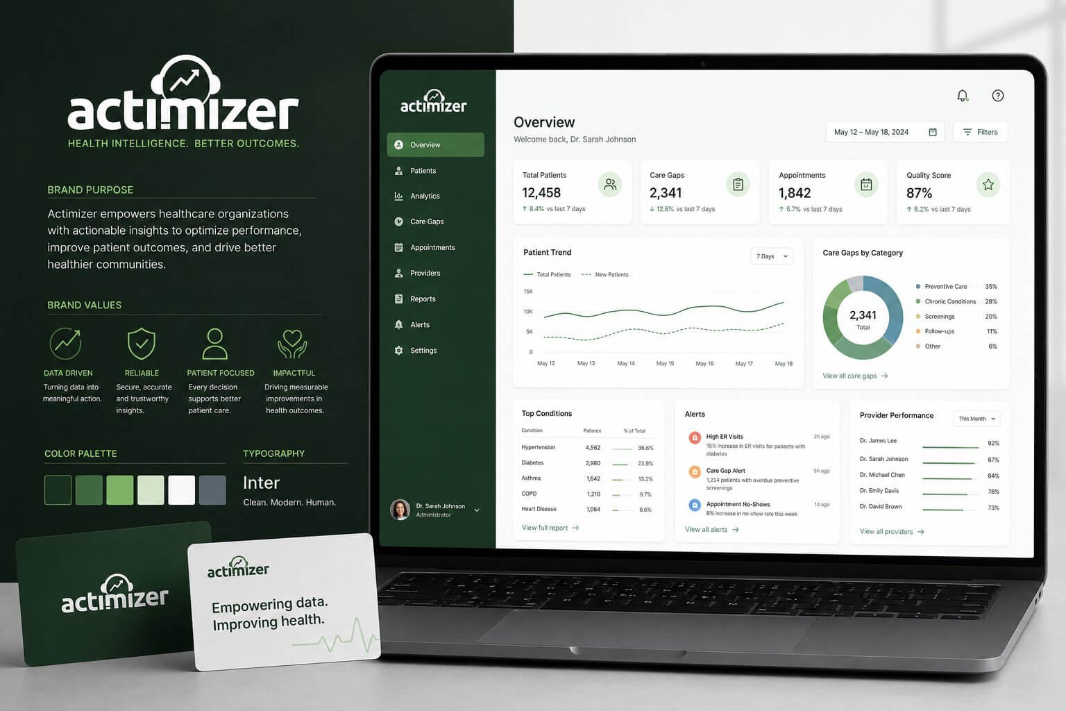
The redesigned navigation collapsed a 14-item sidebar into a contextual 5-item menu with progressive disclosure. The onboarding flow was rebuilt as a four-step guided checklist, visible on every screen during the first session. Empty states were redesigned to direct action rather than display a blank canvas.
Every design decision was prototyped in Figma and tested with five users before handoff. No assumption went unvalidated.
UX Research
Information Architecture
Dashboard Design
Onboarding Flow
Figma Prototyping
Usability Testing
The results
The redesigned dashboard shipped in eight weeks. Time-to-first-action dropped from 9.2 minutes to 3.1 minutes — a 3× improvement. Seven-day activation rate improved from 31% to 67% in the first month post-launch.
3×
Faster onboarding flow
+116%
7-day activation rate
3.1min
Avg. time to first action
8wk
Audit to shipped redesign